Saal Digital Photobook Review
Saal Digital were giving photographers the chance to test out their products, so i jumped on this opportunity to get myself a photobook of my latest trip to Australia! In this review i shall be going over my experiences with the creation of the book and my thoughts on the final product.
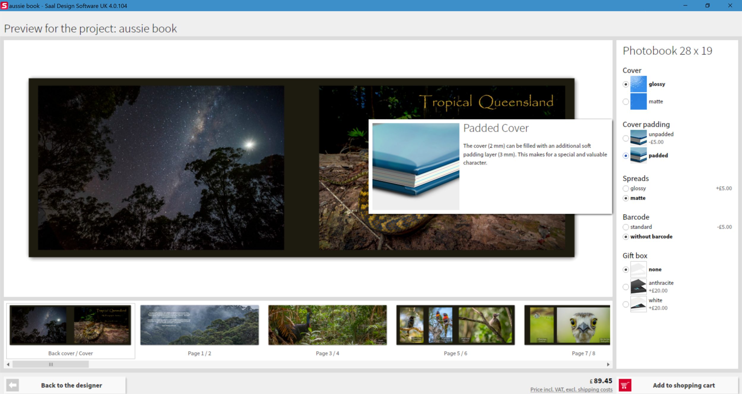
Pictured above is the Saal Design Software, which is required for you to create your photographic creation. It is an easy software to install and is very easy to navigate. The book size i opted for was the 28 X 19.
Placing the images onto the pages is a breeze, but if you have multiple images on the page and you aren't too sure how you would like them arranged, then fear not, as the software has an 'Automatic layout' feature with several options to choose from. This feature helped me out for a lot of pages, however it wasn't always needed. I found it to be a great and very useful feature with plenty of customization options built in.
Throughout the process of making the book i was debating whether or not i should have text overlaying the images, but as it is mostly wildlife i thought it would be best if i had the names of the animals/locations. Applying the text was also an easy process, with a fair amount of different fonts. I like that you can apply the text with a dark background as this helps the text to stand out.
So on to the final product! Once you have completed the design process and added it to your basket, you have a few extra options for some added customization. I decided to go with a glossy front and back cover with glossy pages within. The book itself is a hardback, but they give you an option to have it padded, which i opted for and i must say it feels great! It was an extra £5 to have the barcode removed, which i think is a bit wrong personally, i feel like it shouldn't have one as default and you should be charged if you do want one. Lastly amongst the list of additional extras is the giftbox. It is an extra £20, but as this book will be part of my final year project for university, i thought it would be a good idea to get it as it would also keep the book from getting damaged. The box has a foam insert, cut into shape for your book with a nice small cutout along the edge for you to easily get the book out.
Final thoughts and conclusion:
I'd like to thank the team at Saal Digital for giving me the opportunity to bring my images from Australia to life. I really do like this book, the colours are exactly how they should look. I have had many issues before with some online companies where the prints just look drab and muted, but i can safely say i had zero problems with that here. The book itself looks to be well made, my only slight concern was that i noticed a small amount of scruffiness on one of the corners but i was able to rub it off. It has been designed to be a 'lay flat' book and yes, it really does lay flat. This is perfect for those double page images. The padded covers give the book a great feel in the hands, something i would recommend if you are panning on getting your own. The presentation box is another great feature to give your creation a bit more wow factor.
Pros:
- Perfect colour reproduction (glossy)
- Padded covers
- Easy to navigate software
- Fold flat page design
- Great choice of fonts, could do with a wider choice however
- Delivery took under a week, about 5 or 6 days
Cons
- Bar code removal is an added cost of £5
- Not enough choice of fonts, but the ones they have are pretty good
- I didn't see a way to design the spine of the book
So, yes i would definitely tell anyone looking into creating a photo book to consider using Saal Digital. The final price was expensive, however a 70 page book from some places could cost way more. I hope you have enjoyed reading this review and you can see some of the images which feature in the book here on my website over in the Australia gallery.
Thanks again and i hope you visit again soon!


